Freyr & Devik packaging
Assorted packaging design for Freyr & Devik
While working for Freyr & Devik I got the opportunity to design different packaging and booklets for different products. most of them ended up being used as part of the final product.
One of the main paramaters I was given was to design packaging that could be made out of paper, so it could be recycled after use.
One of the defining aspects of Freyr & Devik products is that the visual identity and design are markedly different from most other hunting accessories, which usually lean heavily towards more “manly” and “rugged”, with black, red and high-vis orange being often used. Freyr & Devik aims to be more sleek, pared back, and higher-end in its design.
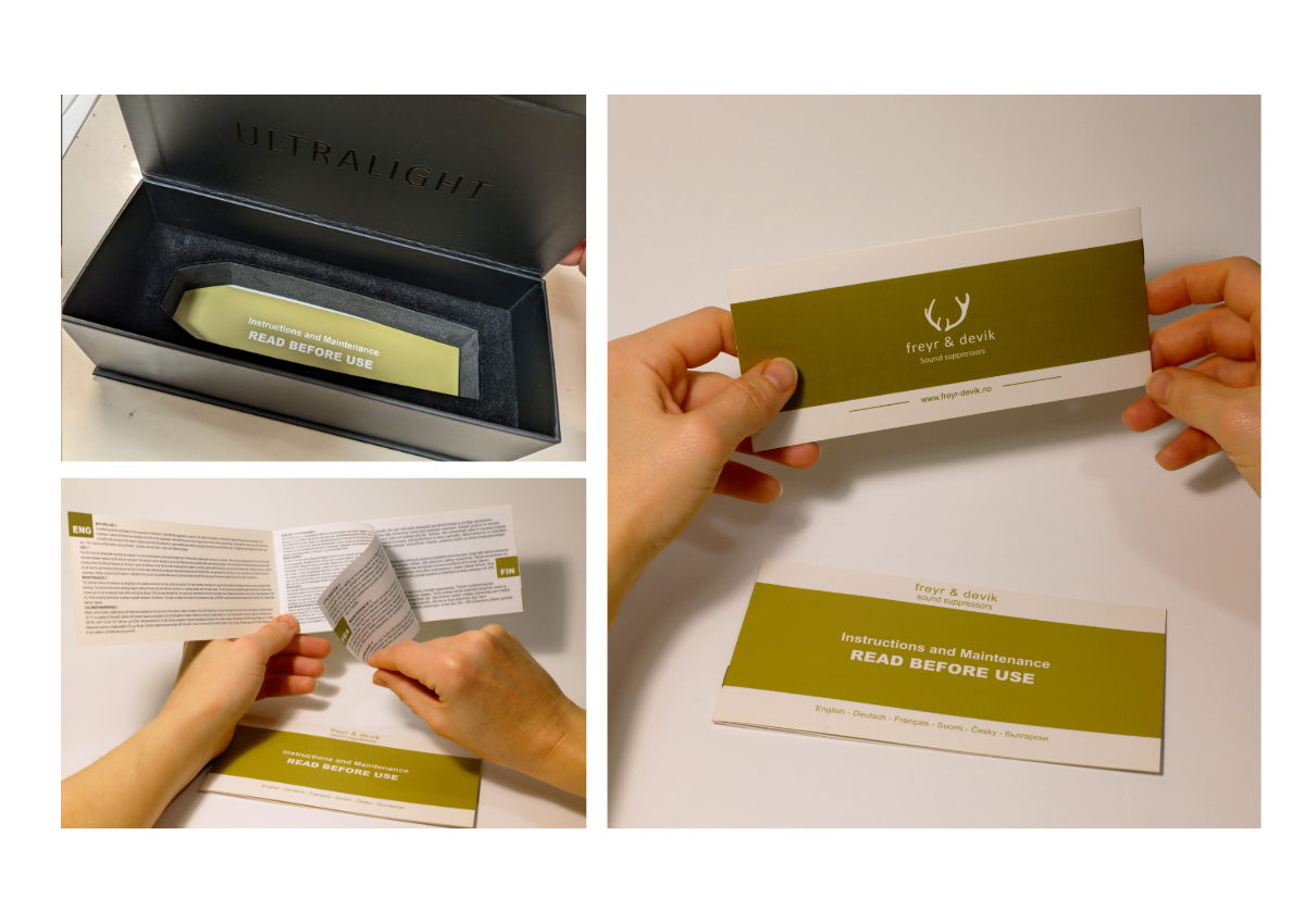
The instruction booklets were made after the box packaging had already been implemented. Because of this it was possible for me to design the booklets to exactly fit the dimensions of the box and for the title to be visible in the foam cutout for when customers take out the product.
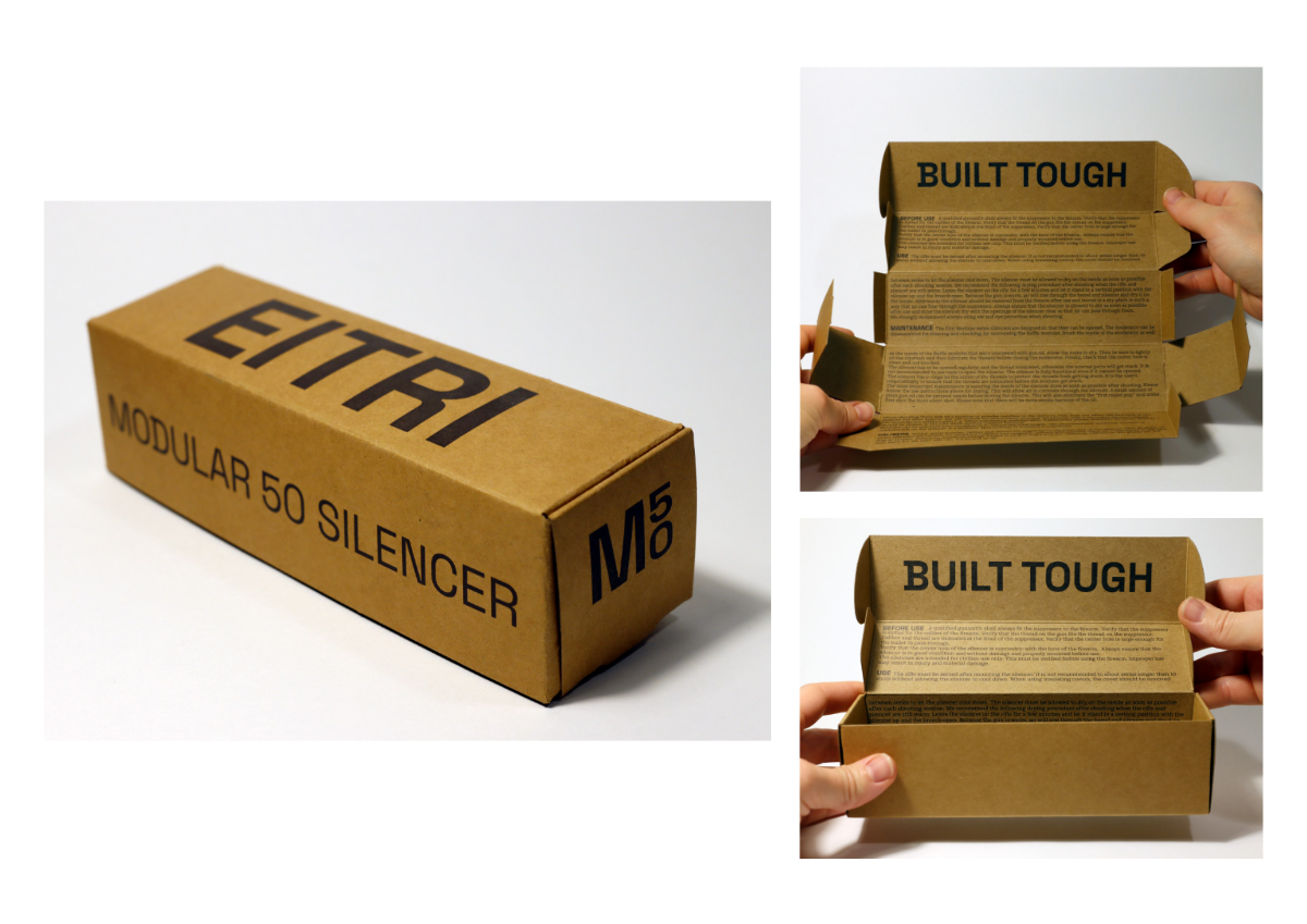
The Eitri box was inspired by old film boxes, where instead of needing to add a booklet, instructions are simply printed on the inside of the box. The Eitri products were meant to be at a lower price point and for a more “rugged” audience than the Freyr & Devik line.
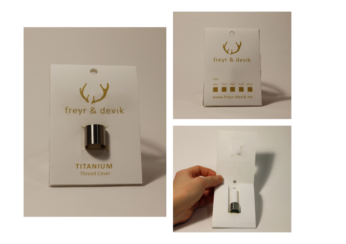
The Thread cover packaging was a mockup of an idea to have the packaging be able to be one stamped piece of paper that could accomodate the different sizes of product and be self-locking.
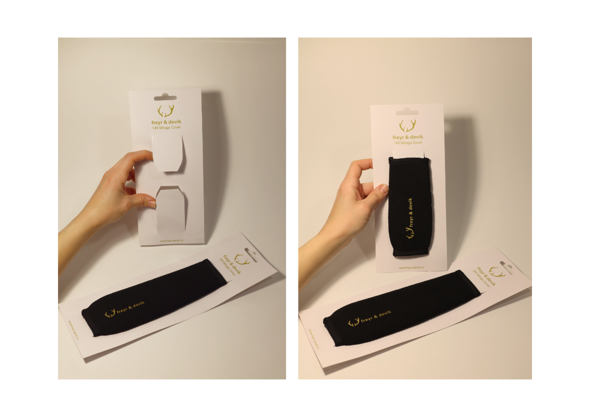
The mirage cover packaging was also a simple but effective design that was easy for the product to be placed and removed, and no extra parts were needed to hold the cover in place.